
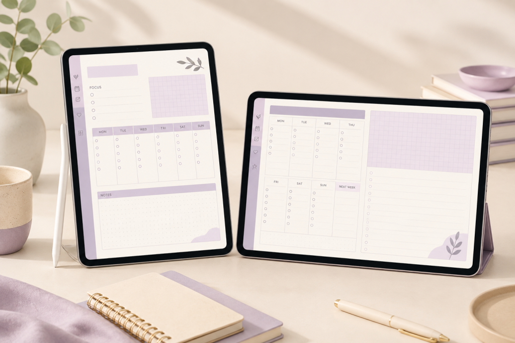
Quick answer: in the digital planner portrait vs landscape decision, choose a portrait digital planner when you prefer a vertical notebook-like page, one-column lists, and using the tablet upright. Choose landscape when you want more horizontal room for weekly schedules, time blocks, project columns, or side-by-side information. The better option is the one that remains readable at your normal zoom in the way you actually hold the device.
Portrait and landscape planners can contain the same categories of pages. Orientation changes the shape of the workspace; it does not prove the date range, hyperlinks, page count, editability, software support, or delivery method. This digital planner portrait vs landscape guide compares each factor so you can match the layout to your routine.
Digital planner portrait vs landscape at a glance
| Decision factor | Portrait | Landscape |
|---|---|---|
| Page shape | Vertical, similar to a notebook page | Wide, similar to a screen or desk planner |
| Natural device posture | Tablet held upright | Tablet turned sideways |
| Writing pattern | Lists, journaling, vertical daily sections | Time blocks, weekly columns, side-by-side notes |
| Overview density | A taller page can suit longer vertical lists | A wider page can suit schedules with several columns |
| Split-screen use | May fit a narrow pane; test the actual writing area | May need zooming in a narrow pane; test on your device |
| Printing | Familiar page proportions | May require landscape print settings |
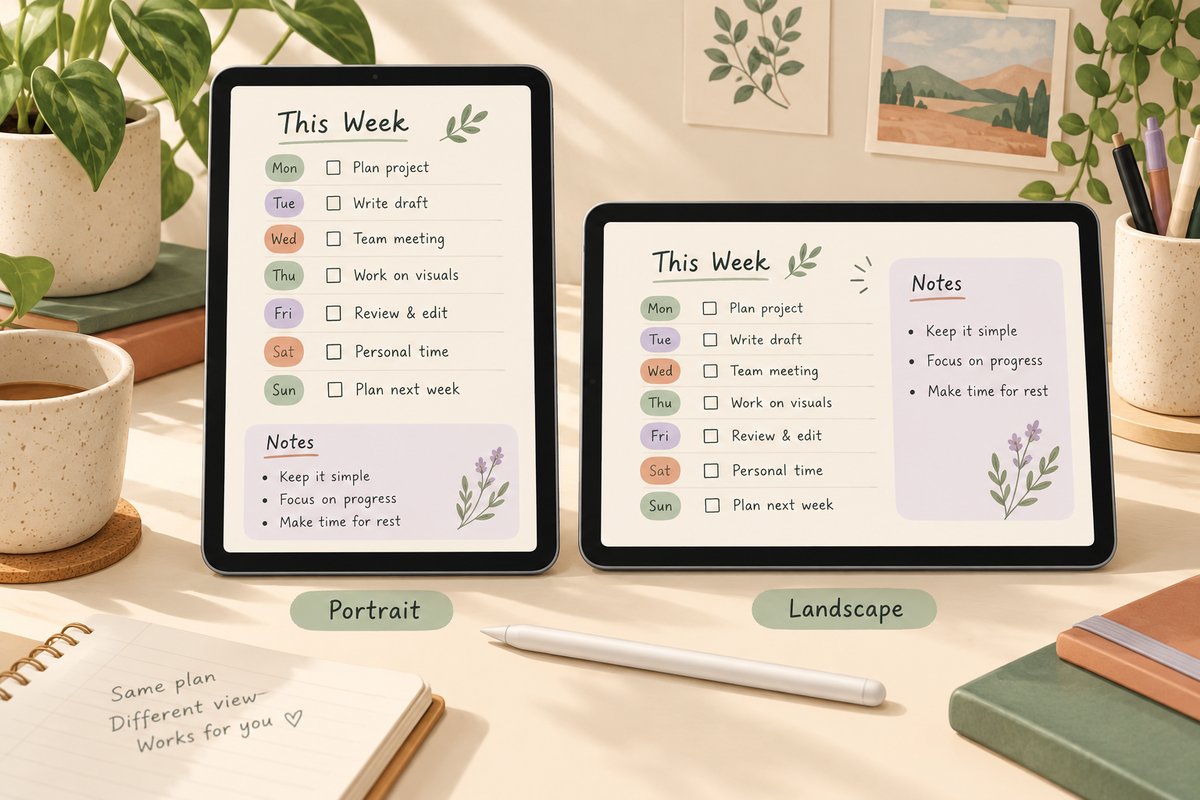
Run a two-minute orientation test
- Place your tablet where you normally plan: desk, sofa, commute, meeting, or classroom.
- Hold it upright for one minute and sideways for one minute.
- Open a representative PDF or screenshot in each orientation.
- Check how much you need to zoom to read headings and write comfortably.
- Notice whether your hand, keyboard, or another app covers the working area.
- Choose based on the repeated task—not the prettiest cover.
This small test is more useful than assuming a larger page count or more tabs will improve the experience. Repeat this digital planner portrait vs landscape test with your most common task — one orientation usually feels clearly easier within two minutes.
Choose portrait for vertical planning
Portrait layouts are a strong fit for daily lists, journaling, notes, appointments, and pages that move from top to bottom. The shape can feel familiar if you already use paper notebooks or vertical documents. In the digital planner portrait vs landscape debate, portrait is the safer default if you mostly write in lists.
Portrait may also work well when you hold the tablet in one hand. The trade-off is horizontal space: wide timetables, multi-column projects, and detailed weekly schedules may need smaller text or more zooming.
Portrait is worth testing when you:
- Write longer notes beneath each heading.
- Prefer one main column instead of several narrow columns.
- Use the tablet upright most of the time.
- Review one day or one topic at a time.
- Plan to print selected pages in a familiar vertical format.
Choose landscape for wider overviews
Landscape layouts provide more horizontal room. That can help with weekly schedules, hourly time blocks, project stages, habit rows, or a dashboard that compares several categories at once. If your week lives in columns, the digital planner portrait vs landscape question usually resolves in landscape’s favor.
The wide shape often feels natural when the tablet sits on a stand with a keyboard or when you plan at a desk. The trade-off is vertical height: long lists may need smaller sections or more page changes.
Landscape is worth testing when you:
- Want to see several weekdays across one spread.
- Use horizontal time-blocking rows.
- Keep reference notes beside the schedule.
- Use the tablet sideways or on a stand.
- Need room for project columns or broader weekly views.
For a practical scheduling workflow, pair the choice with the daily planner for time blocking guide.
Landscape digital planner: a practical decision check
Try a landscape digital planner when your weekly task needs several columns beside one another. If another app leaves too little writing room, compare a portrait page in the same split-screen setup rather than assuming that a sideways tablet needs a wide PDF.
For an iPad workflow, review the iPad planner setup and file-management considerations before choosing.
Consider split-screen and keyboard use
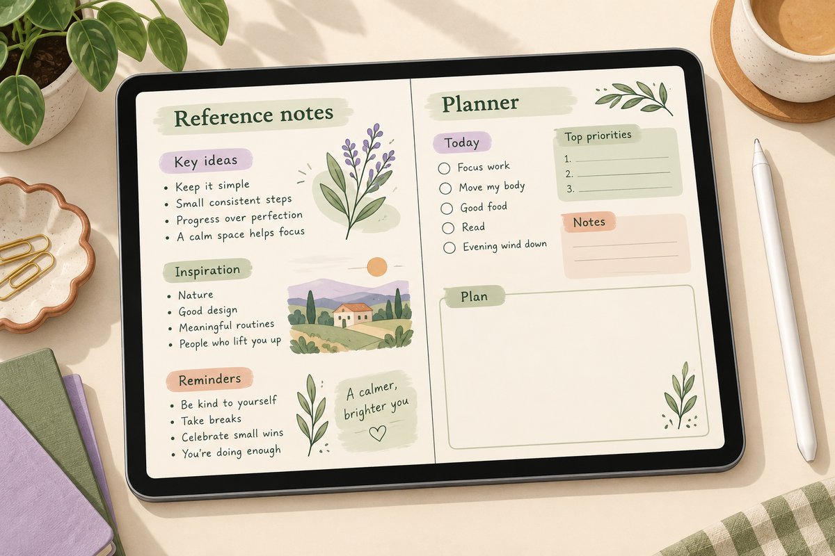
If you regularly place a calendar, browser, video call, or document beside the planner, test the actual split-screen width. A landscape device can still leave the planner pane narrow once another app is open. A portrait planner inside that narrow pane may sometimes preserve a useful vertical flow; in other cases a wide planner may be easier to scan.
Do not choose from device orientation alone. Check the planner page inside the app and multitasking layout you expect to use. Tip: when judging digital planner portrait vs landscape for multitasking, measure the writing area at 50% screen width, not the full-screen page.
Compare the same task in both orientations
Use a sample page to plan three appointments and a five-item task list. Try the page with the tablet upright, sideways, and beside the reference app you normally use. Keep your handwriting size consistent so a smaller font does not hide a cramped layout. This hands-on digital planner portrait vs landscape comparison takes five minutes and prevents the most common regret: buying for the cover instead of the workflow.
If you can see the entire week but must zoom for every note, the overview is useful while the writing area may be too small. If a portrait page leaves plenty of room for notes but hides the weekly context you need, try a different page layout before assuming the device orientation is the problem. Rotating the tablet changes how a PDF fits the screen; it does not redesign the PDF’s page proportions.
Writing space matters more than page count
A planner can contain hundreds of pages and still feel cramped if the fields are too small at normal zoom. Examine the daily and weekly pages you will use most. Ask whether your handwriting fits, whether headings remain readable, and whether the layout leaves enough blank space for corrections. Tip: zoom to 100% and write a full sentence in the smallest field. If your handwriting stays legible without constant zooming, the layout fits your writing size.
If a product preview shows only the cover and tabs, look for real page examples before buying.
Hyperlinks are a separate decision
Orientation does not create hyperlinks. A hyperlinked planner must contain the navigation links in the PDF. Goodnotes’ current PDF hyperlink guidance explains that imported PDF links can navigate to internal pages or external sites and that the interaction method differs by platform and mode.
That official behavior is general app guidance, not evidence that every planner has been tested in every version. Check the product page for verified hyperlink and software information. The hyperlinked digital planner guide explains what to inspect before purchase.
Compare two listed 2026 PDF options
When comparing digital planner portrait vs landscape options, the current Temply Studio product listings describe these two 2026 PDF options:
- 2026 Landscape Daily & Weekly Planner PDF: two hyperlinked 2026 landscape PDFs, one Monday-start and one Sunday-start, with 598 pages each.
- 2026 Portrait Daily Planner PDF: two hyperlinked 2026 portrait PDFs, one Monday-start and one Sunday-start, with 600 pages each.
These specifications are stated on the linked product pages; check the current listing before purchasing. App-specific import behavior has not been independently tested for every platform, so compare the file details and your own software requirements before purchase.
Do not confuse orientation with other choices
- Dated vs undated: determines whether calendar dates are fixed.
- Hyperlinked vs plain: determines whether navigation links are present.
- Editable vs annotation-ready: describes whether the source design can be changed or the PDF is intended for writing.
- Monday vs Sunday start: changes the weekly calendar structure.
- Digital planner portrait vs landscape: changes the page proportions.
Verify each attribute separately instead of inferring it from the product name or cover image.
Frequently asked questions
Can I use a portrait planner while the tablet is sideways?
Usually you can display the page in either device orientation, but the fit and zoom may be less comfortable. Test a representative PDF at your normal writing size.
Is landscape automatically better for Goodnotes?
No. The best orientation depends on the page design, device, platform, posture, and task. Goodnotes support for PDF navigation does not make one page shape universally better. Treat the digital planner portrait vs landscape choice as a workflow decision, not an app decision.
Which orientation is better for time blocking?
Landscape often gives horizontal schedules more room. Portrait can work well for a vertical hourly list. Compare the actual time-blocking page rather than the cover. Either way, run the two-minute digital planner portrait vs landscape test with a real time-blocked day before you buy.
Which orientation is easier to print?
Portrait matches many familiar paper formats, but both can be printed when the printer and scaling settings are correct. Always check print preview first.
Choose the page you will actually use
Portrait is a practical starting point for vertical lists, notes, and upright tablet use. Landscape is a practical starting point for weekly overviews, time blocks, and wider project layouts. Test both at normal zoom, then verify the exact files, dates, navigation, and requirements before buying.
Browse the digital planner collection to compare current verified listings by orientation and planning style. If you prefer an undated planner you can restart anytime, the Minimalist Daily Planner is a flexible place to start. For a dated 2027 option, see the Nursing School Planner 2027. Settle the digital planner portrait vs landscape question first; the remaining choices become much easier once the page shape fits your hand.
Temply Studio
Stop chasing your goals with sticky notes and scattered notebooks. Our premium digital planners and Canva templates are designed to help you plan with intention, stay consistent, and actually enjoy the process.
Questions about this guide?
Ask about the planner, share how you use it, or tell us what to cover next. Your email stays private.