

Quick answer: To color code your planner, give each color one clear meaning, keep that meaning consistent, and pair it with a written label. Start with three categories, such as work, personal, and home. Use separate symbols for task status so a color never has to mean both “work” and “urgent.”
A colorful weekly spread can still be hard to use. If you have to remember whether purple means a meeting, a deadline, or a family commitment, the system needs simplifying. If you want to color code your planner without adding busywork, use the small color key and worked example below to test the setup before applying it to a whole month. It works on paper or in a digital planner; the Goodnotes section covers color presets separately.
1. Decide what the colors should tell you
Choose one question for color to answer. “Which part of my life does this belong to?” is a useful starting point. Other options include which class, client, or family member an entry concerns. Avoid mixing those questions in the same key.
For example, if blue means work, keep every work entry blue whether it is a meeting, a task, or a reminder. Write the time, deadline, or task status beside it instead of inventing another color for each detail.
Start with categories you actually need this week. You can combine small categories or add one later if the distinction changes how you plan. Three is a manageable starting suggestion, not a scientifically proven limit or a rule everyone must follow.
2. Make a simple three-color planner key
Here is an example you can copy or adapt:
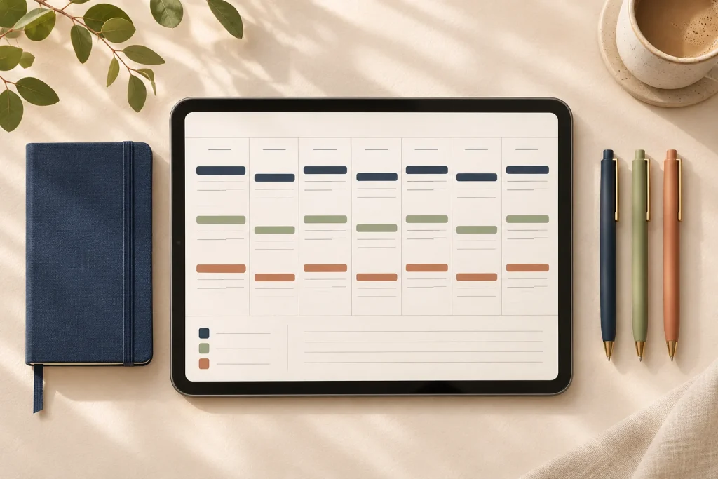
- Work: navy + [W]. Client work, meetings, study sessions, or paid shifts. If you are a student, rename this category “Study” and use [S].
- Personal: sage + [P]. Personal appointments, hobbies, exercise plans, and time with friends.
- Home: terracotta + [H]. Groceries, household tasks, repairs, and shared home responsibilities.
Keep ordinary notes in dark neutral ink. Apply the category color to a short label, a small dot, or a narrow highlight rather than filling the whole entry. This leaves the task description readable and keeps color from overwhelming the page.
Put the key where you will see it: at the top of a weekly spread, on a bookmark, or on a planner dashboard. Use the same category names in monthly and daily views so you do not have to translate the system as you move between pages.
3. Separate category, priority, and status
These are different pieces of information. A household task can be urgent, a work task can be complete, and a personal appointment can move. Keep the category color stable and use a small written or symbolic code for the other details:
- Empty square: a task still to do.
- Check mark: complete.
- Arrow + new date: rescheduled.
- “Due” + date or time: a real deadline.
- Star: an item you have deliberately chosen as a priority.
Write fixed appointments with their actual start time. A colored block in a PDF does not create a calendar notification. If an event needs an alert, set it in the calendar or reminder app you already trust.
For a moved task, record its new date on the old entry and copy it to the new day. Avoid leaving two unchecked copies that both look active. If everything is starred, choose the few items that deserve attention first rather than adding another highlight color.

A worked weekly example
The entries below are fictional examples, not a prescribed schedule. Notice that the labels and words still make the week understandable without seeing any color.
- Monday: [W] Check: team meeting complete. [P] Square: take a walk. [H] Square: plan meals.
- Wednesday: [W] Square: draft proposal. [P] Check: book haircut complete. [H] Arrow: groceries moved to Friday.
- Friday: [W] Square: send proposal. [P] Square: read a chapter. [H] Square: buy groceries.
The work items remain navy even when they are complete. Home tasks stay terracotta when rescheduled. You can scan by life area while the symbols answer what still needs doing.
4. How to color code your planner in Goodnotes
If you already use Goodnotes, open a spare page or a copy of your planner to test the palette. In the writing tool you want to use, select a color preset and select it again to open its options. Choose an existing color or open Custom to choose a color or enter a HEX value. Tap outside the menu to apply it. Goodnotes documents these steps in its color-preset guide; the interface may vary with your platform and version.
Make a short test entry before changing the rest of the week. Check that the label is easy to read against your page background at normal zoom. A shade that looks attractive as a large swatch may be hard to read as small handwriting.
Pen and Highlighter palettes are separate. If you want the same hue in both, copy its HEX value into each tool’s custom-color setting. Goodnotes explains this in why color palettes do not sync across writing tools. A highlighter’s appearance can differ from solid ink, so compare the result on the page rather than relying on the color value alone.
New to the app? Start with our guide to importing a digital planner into Goodnotes, then add your color key after you have checked the file and navigation.
5. Make the system readable without color
Keep the [W], [P], and [H] labels, or write the full category names. Do not depend on a red-versus-green distinction to show whether something is unfinished or complete. Text and symbols are useful when printing in grayscale, sharing a screenshot, or working with someone who perceives colors differently.
This follows the practical principle in W3C’s guidance on using color: important meaning should have another visible cue, such as text or shape. Applying that principle to a personal planner is helpful; it is not a claim that the planner or this color scheme has passed an accessibility audit.
For your own check, view the page at the size you normally use and ask: Can I identify each category from its label? Read every deadline? Tell a moved task from a completed one? If you print, inspect one grayscale test page before printing a full set.
6. Review the key after one week
At your next weekly planner reset, ask which colors helped you find something and which created extra work. Merge categories you rarely use. Rename any category that causes repeated hesitation. Keep the key stable during the week, then make deliberate changes for the next one.
Try the same handful of entries on your chosen layout before buying a different planner. If the background competes with your labels, our aesthetic versus minimalist planner comparison can help you evaluate writing space and visual density.
Frequently asked questions
How many colors should I use in my planner?
Start with three category colors and neutral text. Add another only when it represents a distinction you regularly need to see. If choosing a color takes longer than writing the task, simplify the key.
Should I color code by category or by priority?
Choose one as the main meaning of color. This guide uses categories, with a star for priority and a written deadline. You can reverse that arrangement, but keep the rules consistent and include text labels.
Can I use the same system on paper and digitally?
Yes. Use the same category names and symbols in both places. Exact shades do not have to match perfectly as long as labels preserve the meaning. Keep one place as the current task list to avoid conflicting copies.
Do I need a new planner to start?
No. Try the key on your next blank weekly page first. If you do need a different layout, browse Temply Studio’s digital planners and check the exact files, page previews, app requirements, and license on the product listing. Choose writing space and clear labels before decorative extras.
The sample key and schedule are illustrative. Goodnotes feature references were checked on November 11, 2026.
Temply Studio
Stop chasing your goals with sticky notes and scattered notebooks. Our premium digital planners and Canva templates are designed to help you plan with intention, stay consistent, and actually enjoy the process.


Questions about this guide?
Ask about the planner, share how you use it, or tell us what to cover next. Your email stays private.