
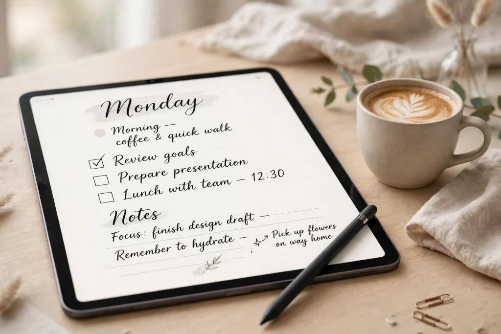
GoodNotes Custom Fonts: How to Add, Install & Use Them in Your Planner
GoodNotes custom fonts are one of the easiest ways to make a digital planner feel like it truly belongs to you. Instead of settling for the same default typefaces on every page, you can install fonts you love on your iPad, pick them inside GoodNotes, and use them for headings, journal entries, labels, to-do lists, and sticker text. The result is a planner that looks polished, feels personal, and is easier to read at a glance.
If you have ever opened a beautiful planner template and wished the typed text matched its style, this guide is for you. You do not need design experience, and you do not need to change how you already plan. Once a font is installed on your iPad, GoodNotes can use it just like any built-in option. This article walks you through the whole process, from installing fonts safely to choosing typefaces that stay readable, pairing them well, and fixing the most common problems when a font does not show up as expected.
Quick Answer: How Do GoodNotes Custom Fonts Work?
Install a font on your iPad first, then select it inside GoodNotes. GoodNotes uses the fonts installed on your device, so the key step happens in iPad Settings or through a font app, not inside the planner itself. Once installed, open a text box in GoodNotes, tap the font picker, and choose your new font. If a font does not appear, check that it is installed and enabled on your iPad, then reopen GoodNotes and try again.
Why Use Custom Fonts in GoodNotes?
A planner is something you look at every day, often several times a day. Small visual details add up. A clean, readable font can make your daily schedule easier to scan, while a warm handwritten-style font can make a journal page feel more inviting. Custom fonts let you match the mood of each notebook: calm and minimal for a daily planner, bold and clear for a work notebook, or playful for a creative journal.
Custom fonts also help you create visual hierarchy. When your headings, subheadings, and body text look distinct, your brain can find information faster. You might use a slightly bolder font for section titles, a simple sans-serif font for tasks and appointments, and a softer font for reflections or gratitude notes. That contrast is not decoration for its own sake; it is a practical way to organise a busy page.
There is another benefit that is easy to overlook: consistency. If you use the same two or three fonts across your planner, notebooks, and stickers, your whole system starts to feel coherent. Your weekly spread, your meeting notes, and your habit tracker will look like parts of one system rather than a collection of unrelated pages. That consistency makes planning feel calmer, which makes it easier to stick with.
Finally, custom fonts are a low-risk way to personalise your setup. Unlike changing your whole planner template, trying a new font takes seconds and can be undone just as quickly. You can test a font on one page, live with it for a few days, and keep it only if it genuinely helps you read and navigate your planner better.
Before You Start: What You Need to Know
GoodNotes does not have its own separate font store. It draws on the fonts installed on your iPad, which means installation is a device-level step. That is good news: once a font is installed, you can often use it in other apps too, and you only need to install it once. It also means that if you switch to a new iPad, you will need to install your favourite fonts again on the new device.
Fonts usually arrive as files, and the most common formats you will meet are TrueType and OpenType files. You do not need to understand the technical difference to use them, but it helps to know that most reputable font sources will give you files your iPad can install. If a download gives you a compressed folder, you will need to open it and install the font files inside, rather than installing the folder itself.
It is also worth checking the licence for any font you download, especially if you plan to share pages publicly, sell templates, or use the font in client work. Many fonts are free for personal use but require a licence for commercial use. A quick check before you download saves confusion later, and supporting independent type designers is a good habit when you find a font you use every day.
How to Install Fonts on iPad for GoodNotes
There are two main routes to install fonts on an iPad: through Settings after downloading a font profile, or through a dedicated font app. Both end in the same place, with the font available system-wide. Choose whichever route feels more comfortable, and remember that you can always remove a font later if you stop using it.
Method 1: Install a Font via Settings > General > Fonts
When you download a font from a trusted source in Safari, your iPad may offer to install it as a configuration profile. This is the route many font websites use, and it is the one that ends in the Fonts screen in Settings. Follow these steps carefully, and do not install profiles from sources you do not trust.
- Download the font from a reputable source in Safari on your iPad. If the download is a compressed folder, tap it in Files to expand it and find the font files inside.
- Tap the font file or the install option provided by the source. Your iPad may ask whether you want to download a configuration profile; confirm only if you trust the source.
- Open Settings > General > VPN & Device Management if prompted, and install the profile for the font. Read the prompt carefully before confirming.
- Go to Settings > General > Fonts. You should see your newly installed font listed there, which confirms the installation worked.
- Open GoodNotes, create or select a text box, and open the font picker. Scroll or search for the font name and tap it to apply it to your text.
- If the font does not appear straight away, close GoodNotes fully and reopen it, then check the font picker again.
This method is reliable because it uses the built-in Fonts screen as your confirmation point. If the font is listed in Settings, GoodNotes should be able to see it. If it is not listed, the installation did not complete, and it is better to repeat the download than to keep searching inside GoodNotes.
Method 2: Install Fonts Using a Font App
Font apps simplify the process by handling downloads, installation, and management in one place. They are especially helpful if you plan to try several fonts, because they let you preview, install, and remove fonts without hunting through Files and Settings for each one. Many font apps also include collections organised by style, which makes browsing easier.
- Install a well-reviewed font app from the App Store and open it on your iPad.
- Browse or search for a font you like, and preview it at different sizes to check readability.
- Tap install and follow the app’s prompts. The app will guide you through the same profile installation step described above.
- Confirm the font appears in Settings > General > Fonts.
- Open GoodNotes and select the font from the text box font picker.
Font apps vary in what they offer, so take a moment to read recent reviews and check whether the app requires a subscription for the features you actually need. A simple installer is often enough; you do not need advanced design tools just to add a few favourite fonts to your planner.
How to Select a Custom Font Inside GoodNotes
Once a font is installed on your iPad, using it in GoodNotes is straightforward. Tap the text tool, tap on the page to create a text box, and type your heading or note. Then select the text, open the font options, and choose your installed font from the list. You can also change the size, colour, and alignment from the same toolbar, so you can style the whole block in one pass.
To change an existing text box, tap it to select it, then tap again to select the text inside. The font picker will show the current font, and you can switch to a different one without retyping anything. This makes it easy to experiment: duplicate a page, try a new font on the copy, and compare the two versions side by side before committing.
A useful habit is to set your most-used fonts as part of a simple style routine. For example, decide that headings are always one font and size, body text is always another, and labels are always a third. When that routine becomes automatic, formatting a new weekly spread takes seconds, and your planner stays consistent without extra effort.
How to Use Custom Fonts in Planners, Notebooks, and Stickers
Installing a font is only the first step. The real value comes from using it deliberately across your planning system. Different parts of a planner benefit from different kinds of type, and a little intention goes a long way.
Planners: Headings, Dates, and Daily Lists
In a daily or weekly planner, readability matters more than novelty. Your headings should stand out clearly, your dates should be easy to scan, and your task lists should be comfortable to read at a normal zoom level. A clean sans-serif or a simple serif font usually works best for body text, while a slightly bolder version of the same family can carry headings without clashing.
Try this approach in a 2027 Life Planner: use one font for month and week titles, a second plain font for appointments and tasks, and keep decorative fonts for small accents only, such as a motivational quote at the top of a weekly page. When the functional text stays plain, the decorative touches feel special instead of distracting.
Colour can support your font choices too. A dark, high-contrast colour for tasks and a softer colour for notes or completed items helps your eye move across the page. Keep the palette small, perhaps two or three colours plus black or dark grey, so the page stays calm even when the day is busy.
Notebooks: Journaling, Study Notes, and Meeting Notes
Notebooks give you more freedom because they are often read more slowly than a schedule. A journal page can carry a softer, more personal font, while study notes benefit from a highly legible font that stays clear even at smaller sizes. Meeting notes sit in between: they need clear headings for topics and decisions, and plain body text for action points.
In a 12-Tab Digital Notebook for GoodNotes, you can give each section its own feel while keeping one shared body font for consistency. For example, a journal tab might use a gentle handwritten-style font for reflections, while a study tab uses a crisp, even font for summaries and definitions. The shared body font ties the notebook together, and the section accents give each tab its own character.
For longer notes, avoid fonts with very narrow spacing or unusual letter shapes. They may look attractive in a heading, but they tire the eyes over a full page. Test any new font by typing a full paragraph, not just a heading, and read it back at the size you will actually use. If you have to slow down to decode letters, choose something simpler for body text.
Stickers and Labels: Short Text, Big Impact
Stickers and labels are short by nature, so they are the perfect place for a more expressive font. A single word such as “Focus”, “Payday”, or “Holiday” can carry a decorative typeface without hurting readability, because there is very little text to decode. This is also where a handwritten-style font can shine, adding warmth to an otherwise structured planner page.
Keep sticker text short, and check it at the size it will appear on the page. A font that looks charming at large size can become muddy when shrunk to fit a small label. If a sticker label is hard to read at a glance, it has lost its purpose, no matter how pretty it looks in isolation. When in doubt, choose clarity over flourish for anything you need to act on, such as deadlines or reminders.
You can also use fonts to create your own simple text stickers inside GoodNotes. Type a label, style it, and copy it wherever you need it. Reusing the same styled labels across weeks saves time and keeps your planner looking intentional, even on busy days when you are planning in a hurry.
Choosing Fonts That Stay Readable
Good font choices share a few qualities: clear letter shapes, comfortable spacing, and a size that suits the job. Avoid fonts where similar letters look almost identical, where the spacing is very tight, or where decorative details overwhelm the letterforms. These issues are easy to miss in a short preview but become obvious after a week of daily use.
Pairing fonts is simpler than it sounds. A reliable rule is to pair one distinctive font with one plain font. The distinctive font carries headings and accents, while the plain font carries everything you need to read quickly. Two distinctive fonts on the same page often compete for attention, and the page ends up feeling noisy rather than stylish.
- Headings: one font with personality, used consistently for titles and section names.
- Body text: one plain, highly legible font for tasks, notes, and journal entries.
- Accents: optionally, one decorative font for quotes, stickers, and special labels only.
- Sizes: keep a clear gap between heading and body sizes so hierarchy is obvious at a glance.
Also consider how a font looks in both light and dark contexts, and at different zoom levels. A planner page is often viewed zoomed out, so a font that only works at full size may disappoint in everyday use. Zoom out, scan the page as you would on a busy morning, and ask whether the important information still jumps out.
Free vs Paid Font Sources: What to Expect
Free font sources are a great starting point, and many excellent fonts are available without cost for personal use. They let you experiment widely before committing to a particular style. The trade-off is that free collections vary in quality: some fonts include a full set of characters and weights, while others cover only basic letters and may look incomplete when you type numbers, punctuation, or accented characters.
Paid fonts, whether bought individually or through a font service, often come with more complete character sets, multiple weights, and clearer licensing. That completeness matters if you write in more than one language, use lots of numbers in a budget planner, or want bold and italic versions that match properly. Paying for a font you use daily is often good value, but it is not a requirement for a beautiful planner.
A sensible approach is to start free, narrow your taste to two or three styles you genuinely use, and only then consider paid options in those styles. Keep a short list of fonts you love and fonts you tried and rejected, with a note about why. That list prevents the common trap of installing dozens of fonts, forgetting which ones you liked, and scrolling through a long picker every time you format a text box.
Wherever you get fonts, stick to sources with a clear reputation, readable licence terms, and files that install cleanly through the normal iPad process. Avoid sites that ask you to install unrelated apps, grant unusual permissions, or download installers instead of font files. If a source feels pushy or unclear, skip it; there are plenty of trustworthy alternatives.
Custom Fonts and Your Planner Workflow
Fonts work best when they support a workflow you already enjoy, rather than becoming a project of their own. A good test is whether a new font makes your next planning session faster or more pleasant. If choosing fonts starts to eat into the time you spend actually planning, simplify: pick your favourites, remove the rest, and get back to using the planner.
One practical routine is to set up a template page that shows your chosen fonts in action. Create a page with a heading, a subheading, a short task list, a journal paragraph, and a sticker label, each styled as you intend to use them. Save that page as a reference inside your planner, or duplicate it whenever you start a new notebook. That reference page removes guesswork and keeps new sections consistent with the rest of your system.
Seasonal refreshes are another gentle way to use custom fonts. You might keep your core body font all year and change only the heading font for a new season, a new project, or a fresh planner year. A Minimalist Undated Digital Life Planner for GoodNotes pairs well with this approach, because its clean layout lets a single new heading font change the whole feel of the page without any restructuring. Small, intentional changes keep planning enjoyable without constant redesign.
It also helps to review your fonts occasionally. If a font you loved in January feels hard to read by March, that is useful information, not a failure. Swap it for something clearer, update your reference page, and move on. Your planner should evolve with your needs, and fonts are one of the easiest parts of that evolution to adjust.
Troubleshooting GoodNotes Custom Fonts
Most font problems have simple causes. Work through the checks below in order, and you will usually find the issue quickly.
Font Not Showing in GoodNotes
First, confirm the font is installed by checking Settings > General > Fonts on your iPad. If it is not listed, the installation did not complete, and you should reinstall it from your trusted source or font app. If it is listed but still missing in GoodNotes, close GoodNotes fully, reopen it, and check the font picker again. Also check whether you are looking in the right place: fonts are chosen from the text box toolbar, not from the pen or highlighter settings.
Another common cause is a mistyped font name. Font pickers sort alphabetically, and a font may sit under a slightly different name than you expected, especially if it belongs to a family with several weights. Scroll through the list slowly, or use search if GoodNotes offers it, before concluding that the font is absent.
Handwriting vs Typed Text: Why Fonts Only Affect Typed Text
Custom fonts apply to typed text boxes, not to handwriting made with the Apple Pencil or a stylus. That distinction confuses many new users. If you write by hand, your handwriting style is the style, and no font setting will change it. Fonts matter when you type: headings, typed notes, labels, and any text you add with the text tool.
This is not a limitation to fight; it is a reason to use both modes well. Handwriting is wonderful for brainstorming, sketching, and personal notes, while typed text is ideal for anything you want to keep perfectly legible, searchable, or consistently formatted. Many planners mix the two: typed headings and task lists for structure, handwritten annotations for thoughts and ideas. Let each mode do what it does best.
Fonts and PDF Export: What to Watch For
When you export a GoodNotes page or notebook as a PDF, typed text usually keeps its font on the device where you view it, provided the font is available there. If you share the PDF with someone who does not have that font installed, their viewer may substitute a different font, and spacing or appearance can shift slightly. For personal archives this rarely matters, but for shared documents it is worth keeping in mind.
If a shared PDF must look exactly the same everywhere, consider exporting a copy for sharing and checking it on another device before sending it widely. Alternatively, use a widely available font for documents you share, and save your most distinctive fonts for personal planner pages. A quick preview step avoids surprises and keeps shared notes looking professional.
Finally, if a font looks different after an iPad software update, check the Fonts screen again. Updates occasionally change how installed profiles are handled, and reinstalling the font usually restores it. Keep a note of your favourite font sources so reinstalling is quick rather than a fresh search each time.
Frequently Asked Questions About GoodNotes Custom Fonts
Can I use any font I download in GoodNotes?
You can use any font that installs successfully on your iPad and appears in Settings > General > Fonts. GoodNotes uses the fonts installed on your device, so installation is the deciding step. Always download from trusted sources, check the licence for how you plan to use the font, and avoid installing profiles from unfamiliar websites.
Do custom fonts work on iPhone as well as iPad?
Fonts installed on a device are generally available to apps on that device, but your planning experience will differ by screen size and by how you use GoodNotes on each device. If you plan mainly on iPad, install and test your fonts there first, then check the same fonts on your other devices if you sync notebooks between them. A font that looks great on a large iPad page may feel cramped on a smaller screen, so test readability on each device you actually use.
Will my custom fonts disappear if I update GoodNotes or iPadOS?
Normal app and system updates should not remove your installed fonts, but it is sensible to keep a list of your favourite fonts and their sources. If a font ever goes missing after an update, check Settings > General > Fonts first, then reinstall it from the original source. Keeping that short list turns a minor annoyance into a two-minute fix.
How many fonts should I use in one planner?
Two fonts are enough for most planners: one for headings and one for body text, with an optional third for accents such as stickers or quotes. More than three distinctive fonts on one page usually looks cluttered and slows down scanning. Consistency matters more than variety, so choose fonts you enjoy reading every day, not just fonts that look exciting in a preview.
Final Thoughts: Make Your Planner Feel Like Yours
GoodNotes custom fonts are a small change with an outsized effect. They do not replace good planning habits, but they support them: clearer headings help you find information faster, a favourite body font makes daily review more pleasant, and a consistent style across planners and notebooks makes the whole system feel settled. Start with one or two fonts, use them deliberately for a week, and adjust based on what actually helps you plan.
The best planner is the one you return to, and personal details are part of what brings you back. A font that feels like yours, paired with a layout you trust, turns a routine task into a moment you look forward to. Install thoughtfully, keep readability first, and let your planner grow with you through the year.
Ready to put your new fonts to work? Explore the 2027 Life Planner and start styling your year with type that feels personal, clear, and unmistakably yours.
Temply Studio
Stop chasing your goals with sticky notes and scattered notebooks. Our premium digital planners and Canva templates are designed to help you plan with intention, stay consistent, and actually enjoy the process.
Questions about this guide?
Ask about the planner, share how you use it, or tell us what to cover next. Your email stays private.