
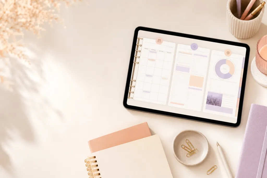
Quick answer: choose an aesthetic digital planner when visual cues, color, decorative elements, and themed pages help you recognize sections and enjoy returning to the planner. Choose a minimalist digital planner when you want fewer visual elements competing with your writing, tasks, and schedule. Neither style is inherently more productive; the better choice is the one that keeps important information easy to find at your normal screen size.
The useful comparison is not “pretty versus plain.” Aesthetic and minimalist planners can both be well organized or confusing. What matters is visual density, hierarchy, page purpose, and whether the design still works after you add your own handwriting, stickers, highlights, and notes.
Aesthetic vs minimalist digital planner at a glance
| Criteria | Aesthetic style | Minimalist style |
|---|---|---|
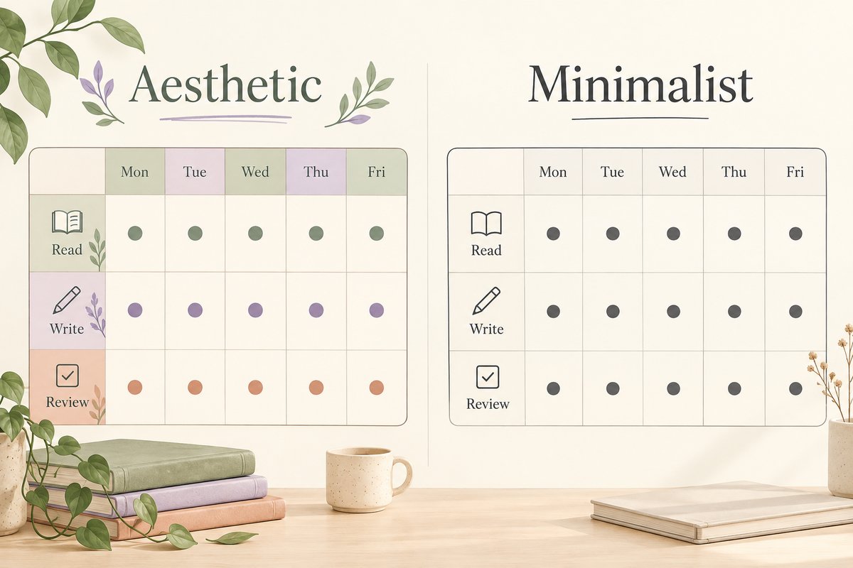
| Visual density | Often uses more color, graphics, decorative dividers or themed details | Usually uses fewer decorative elements and more open space |
| Section recognition | Can use color and visual themes as cues | Relies more on labels, spacing and consistent structure |
| Writing space | Varies; decoration may reduce open areas | Often prioritizes open writing areas |
| Customization | May feel complete without many additions | Can provide a neutral base for your own visual system |
| Main risk | Too many elements can compete with your information | Too little hierarchy can make sections feel similar |
Choose an aesthetic planner when visual cues help you navigate
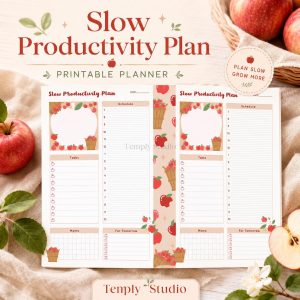
An aesthetic planner can work well when the decoration has a job. A color family might separate months, a visual divider might mark projects, or a themed dashboard might make major sections recognizable without reading every label.
The key test is what happens after you add real content. A clean product preview may show only a few example words. Your working page may contain appointments, notes, highlights, handwriting, stickers, and links. If the background or decorative elements make that information harder to scan, the style is adding friction instead of helping.
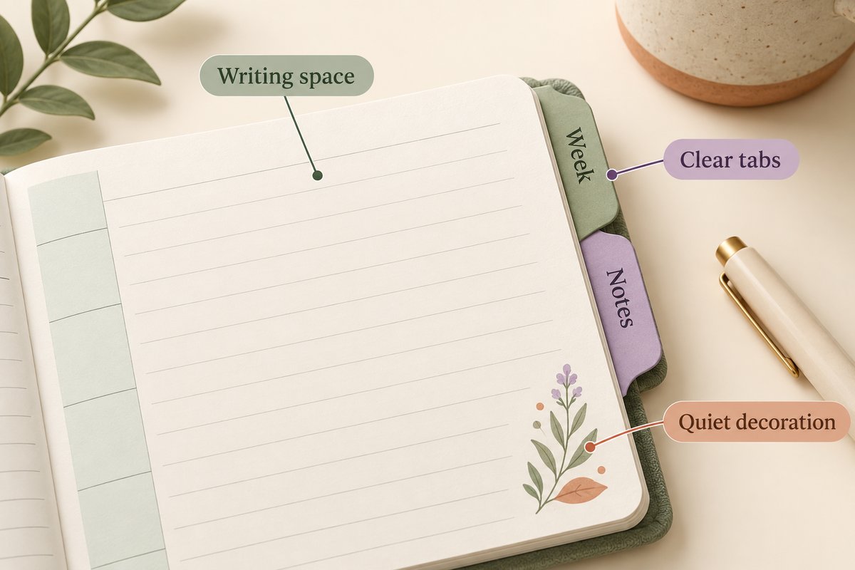
Useful aesthetic elements can include
- consistent section colors that support navigation;
- clear dividers between major planning areas;
- icons with text labels rather than icons alone;
- decorative details that stay away from writing zones;
- a limited type and color system that remains readable at normal zoom.
Aesthetic design becomes harder to use when every page competes for attention. If each tracker, heading, border, and sticker has equal visual weight, it becomes difficult to see what matters first.
Choose a minimalist planner when your own information should dominate
A minimalist layout reduces the number of elements you need to visually filter before reaching your tasks, appointments, and notes. That can be useful if you write heavily, use an Apple Pencil or stylus often, or prefer to add your own highlights and stickers.
Minimalism is not simply “use less.” A strong minimalist page still needs hierarchy: the date should be easy to find, sections should have clear boundaries, and repeated layouts should behave consistently. Removing too many cues can make every page look the same.
For a closer look at spacing, hierarchy, and visual density, read the minimalist digital planner layout guide.
A same-content test for two planner styles
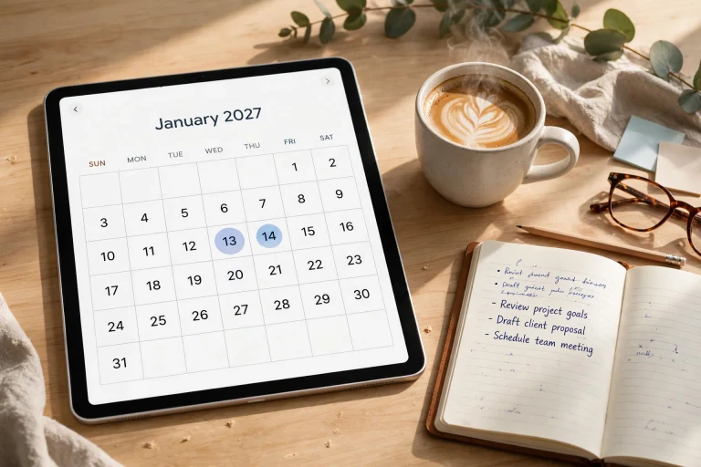
If the seller provides usable samples, put the same information on both: two appointments, three tasks, one deadline, and a short note. Keep your handwriting size and zoom level consistent. If there is no sample, use detailed page previews to judge space and ask about any unclear feature before buying.
- Open the page at the zoom level you normally use.
- Add realistic content instead of placeholder text.
- Check whether headings and dates remain easy to identify.
- Notice whether decoration overlaps your writing or makes small text harder to read.
- Navigate between sections and confirm that labels or hyperlinks are understandable.
- Come back to the page later and see whether you can find the next action quickly.
Check whether you can find the deadline without relying on its color, read the smallest label, and add a correction without covering a tab. Choose the layout that handles your real entries comfortably. A design that looks spacious while empty may need too much zooming once filled.
Visual style is only one buying decision
A planner can match your preferred aesthetic and still be the wrong file for your workflow. Before choosing, verify the basics:
- Dated or undated: does the calendar period match when you will use it?
- Portrait or landscape: does the page fit the way you hold or split your screen?
- File format: is it a ready-to-use PDF, an editable source, or another format?
- Navigation: if hyperlinks matter, are they actually included and supported by your app?
- Software requirements: does the listing name the app or editing account you need?
- License and delivery: are usage rights and download instructions clear?
The beginner’s digital planner guide walks through these choices in order.
How color can help without becoming clutter
If you prefer color, give it a limited role. For example, one color can identify appointments and another can mark deadlines, while the page background remains quiet. Avoid using color as the only way to communicate meaning; labels and headings should still make sense when printed, viewed in grayscale, or used by someone who perceives color differently.
A minimalist planner can also use color. The difference is usually how much of the page is decorative versus functional, not whether color exists at all.
The W3C guidance on using color recommends another visible cue, such as text or shape, when color carries meaning. Apply that principle to your planner labels; a colored deadline should still have a readable date and description.
How stickers affect the comparison
If you use digital stickers regularly, an already-busy planner may leave less visual space for them. A neutral layout can give stickers more room, while a themed aesthetic planner may reduce the need to add decorative elements yourself. Neither workflow is better; decide how much customization you actually enjoy maintaining.
Common mistakes when choosing by style
- Buying from the cover alone: the daily and weekly pages matter more than the cover once you start planning.
- Assuming minimalist means fewer features: visual simplicity does not tell you what files or pages are included.
- Assuming aesthetic means harder to use: a decorated planner can still have excellent hierarchy and navigation.
- Ignoring your screen: small text and thin lines may look different on your actual device.
- Confusing editable design with annotation: writing on a PDF is different from editing the source layout in a design app.
Frequently asked questions
Are minimalist digital planners better for focus?
Not automatically. Fewer visual elements may feel easier for some people to scan, while other users rely on color and visual cues. Treat focus as a personal workflow preference, not a guaranteed outcome of a design style.
Can an aesthetic planner still be professional?
Yes. Professional use depends on context, readability, and what information you record. A polished visual style can still be practical if labels, contrast, and writing areas remain clear.
Can I make a minimalist planner more aesthetic later?
If the file and app support the additions you want, you can add handwriting, highlights, images, or stickers. That does not mean the underlying planner source is editable, so check the product’s file format before purchase.
Do hyperlinks depend on the planner style?
No. Hyperlinks are a file/navigation feature rather than a visual style. Goodnotes documents current ways to follow PDF hyperlinks; verify the specific planner includes working links.
Choose the style that leaves room for your information
A useful planner should make your own dates, priorities, and notes more visible—not turn them into background decoration. Test the real working pages, then compare date setup, orientation, navigation, file format, and software requirements.
You can browse the Temply Studio digital planner collection, but confirm the exact included files, compatibility, delivery, and license on each product page.
Official reference
Temply Studio
Stop chasing your goals with sticky notes and scattered notebooks. Our premium digital planners and Canva templates are designed to help you plan with intention, stay consistent, and actually enjoy the process.


Questions about this guide?
Ask about the planner, share how you use it, or tell us what to cover next. Your email stays private.